To effectively plot dates and times in Tableau you sometimes need to do some prep work. In this example we concatenate a ‘Date’ and ‘Start Time’ field and then we use intervals to ‘bucket’ the records into 15 minute time slots.
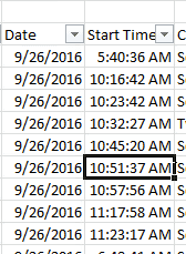 |  |
In the above screenshot you can see the ‘Date’ and ‘Start Time’ fields that we will be concatenating. Begin by creating a calculated field:
DATEADD(
‘hour’, DATEPART(‘hour’, [Start Time]), DATEADD(
‘minute’, DATEPART(‘minute’,[Start Time]), DATEADD(
‘second’, DATEPART(‘second’,[Start Time]), [Date])))
The ‘Date’ and ‘Start Time’ columns are now combined into a single field.
- Select Analysis —> Create Calculated Field
- In the ‘Name’ text box, enter a name for the calculated field.
- In the ‘Formula’ text box, enter the formula below:
DATEADD(
‘hour’, DATEPART(‘hour’, [Start Time]), DATEADD(
‘minute’, DATEPART(‘minute’,[Start Time]), DATEADD(
‘second’, DATEPART(‘second’,[Start Time]), [Date])))
The ‘Date’ and ‘Start Time’ columns are now combined into a single field.
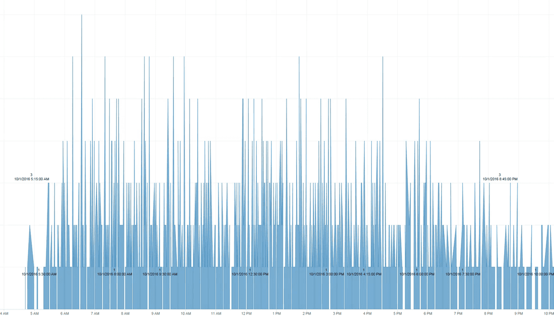
In the above screenshot you can see how the data appears in the visualization. It's super busy, and perhaps it’s not very meaningful to visualize each minute of each day on a chart. So, you can then use more calculations to ‘bucket’ those records into 15 minute intervals.
To calculate your intervals, use this simple binning technique: There are 24 hours/day * 60 min/hr / 15 min bins = 96 bins.
Create a calculated field using this formula:
DATETIME(INT(FLOAT([Datetime])*96)/96)
and voilà……
To calculate your intervals, use this simple binning technique: There are 24 hours/day * 60 min/hr / 15 min bins = 96 bins.
Create a calculated field using this formula:
DATETIME(INT(FLOAT([Datetime])*96)/96)
and voilà……
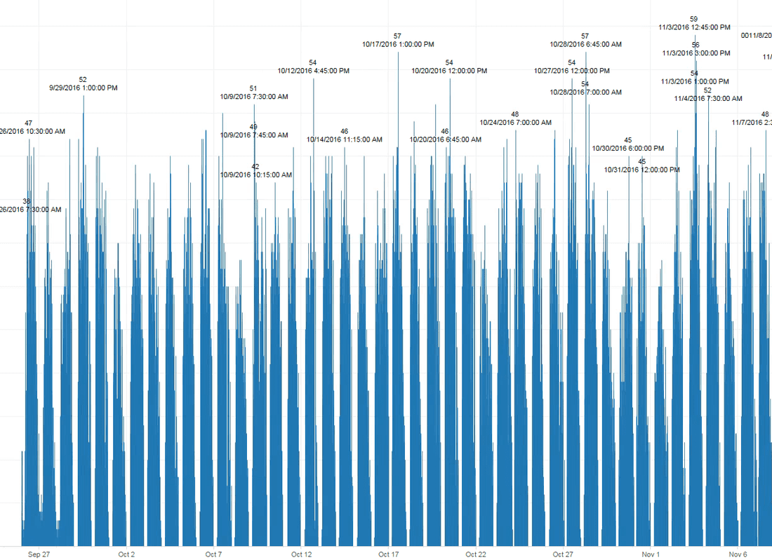
Now you can visualize more dates and clearly see the trends and spikes in activity.

 RSS Feed
